Updates to Flocabulary’s Unit Page
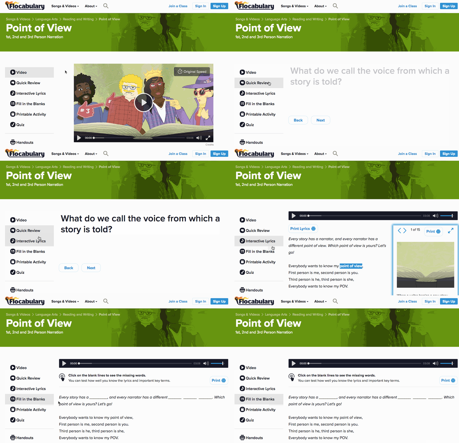
If you’ve used Flocabulary over the past couple of days, you may have noticed something different about its appearance. We recently launched a new design for our unit page to improve navigation and your overall experience using Flocabulary.
Our corresponding activities, which once lived perched atop our videos, have migrated to the left-hand side—it’s the same great Flocab content you’ve grown to love, just in a new location.
Here’s how the new navigation works:

Why change the navigation?
Good question. In addition to following best practices for usability and design, we updated our unit pages because:
- The new design leaves room for us to easily add new features along the left (more on that in a future post!). Adding additional elements to a horizontal navigation can get real cramped, real quick. Moving to a vertical design helps us plan better for Flocab’s future.
- For teachers, the new navigation makes seeing and previewing our printable activities easier. Everything you need to teach a Flocabulary unit is streamlined in one place.
- Students can now more easily discover activities, encouraging them to dive deeper into Flocabulary.
We’d love to hear your thoughts on our new design. Leave a note in the comments or shoot us an email.
We’ve got even more Flocab news coming your way shortly. Stay tuned!
